Bootstrap 5 Card component
Responsive card built with the latest Bootstrap 5. The card component is a flexible and extensible content container includes options for headers and footers, a wide variety of content, contextual background colors, and powerful display options.
Basic card
Card title
Some quick example text to build on the card title and make up the bulk of the card's content.
<div class="card">
  <div class="card-body">
    <h5 class="card-title">Card title</h5>
    <p class="card-text">
      Some quick example text to build on the card title
      and make up the bulk of the card's content.
    </p>
    <button type="button" class="btn btn-primary">Learn More</button>
  </div>
</div>
Media card
Using .card-img-top adding an image to reinforce the content.
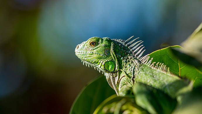
Lizard
Lizards are a widespread group of squamate reptiles, with over 6,000 species, ranging across all continents except Antarctica.
<div class="card">
  <img src="/images/cards/1.jpg" class="card-img-top" alt="green iguana" />
  <div class="card-body">
    <h4>Lizard</h4>
    <p class="card-text">
      Lizards are a widespread group of squamate reptiles, with over
      6,000 species, ranging across all continents except Antarctica.
    </p>
    <div>
      <button class="btn btn-primary" type="button">Share</button>
      <button class="btn btn-link" type="button">Learn More</button>
    </div>
  </div>
</div>
Complex Interaction
In this example, using the .card-header, .card-footer, .card-img-top and dropdown menu to build.
Shrimp and Chorizo Paella
September 14, 2022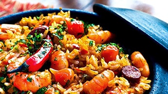
This impressive paella is a perfect party dish and a fun meal to cook together with your guests. Add 1 cup of frozen peas along with the mussels, if you like.
<div class="card">
  <div class="card-header d-flex align-items-center">
    <span class="avatar text-bg-primary avatar-lg fs-5">R</span>
    <div class="ms-3">
      <h6 class="mb-0 fs-sm">Shrimp and Chorizo Paella</h6>
      <span class="text-muted fs-sm">September 14, 2022</span>
    </div>
    <div class="dropstart ms-auto">
      <button class="btn text-muted" type="btn" data-bs-toggle="dropdown" aria-expanded="false">
        <i class="fas fa-ellipsis-v"></i>
      </button>
      <ul class="dropdown-menu">
        <li>
          <a class="dropdown-item" href="#">Action</a>
        </li>
        <li><a class="dropdown-item" href="#">Another action</a></li>
      </ul>
    </div>
  </div>
  <img src="/images/cards/2.jpg" class="card-img-top" alt="green iguana" />
  <div class="card-body">
    <p class="card-text">
    This impressive paella is a perfect party dish and a fun meal to cook together with your guests.
    Add 1 cup of frozen peas along with the mussels, if you like.
    </p>
  </div>
  <div class="card-footer d-flex">
    <button class="btn btn-link p-0 me-auto fw-bold" href="#">Action</button>
    <button class="btn btn-subtle" type="button"><i class="fas fa-heart fa-lg"></i></button>
    <button class="btn btn-subtle" type="button"><i class="fas fa-share fa-lg"></i></button>
  </div>
</div>
Structure
Body
The building block of a card is the .card-body. Use it whenever you need a padded section within a card.
<div class="card">
  <div class="card-body">
    This is some text within a card body.
  </div>
</div>
Header
Add an optional header .card-header within a card.
Special title treatment
September 14, 2022<div class="card">
<div class="card-header d-flex align-items-center border-bottom">
<span class="avatar text-bg-primary avatar-lg fs-5">R</span>
<div class="ms-3">
<h6 class="mb-0 fs-sm">Special title treatment</h6>
<span class="text-muted fs-sm">September 14, 2022</span>
</div>
<button class="btn text-muted ms-auto" type="btn"><i class="fas fa-ellipsis-v"></i></button>
</div>
<div class="card-body">
With supporting text below as a natural lead-in to additional content.
</div>
</div>Card headers can be styled by adding .card-header to <h*> elements.
Featured
Special title treatment
With supporting text below as a natural lead-in to additional content.
<div class="card">
  <h5 class="card-header">Featured</h5>
  <div class="card-body">
    <h5 class="card-title">Special title treatment</h5>
    <p class="card-text">
      With supporting text below as a natural lead-in to additional content.
    </p>
  </div>
</div>
Footer
Add an optional footer .card-footer within a card.
Special title treatment
With supporting text below as a natural lead-in to additional content.
<div class="card">
  <div class="card-body">
    <h5 class="card-title">Special title treatment</h5>
    <p class="card-text">
      With supporting text below as a natural lead-in to additional content.
    </p>
  </div>
  <div class="card-footer text-muted">
    September 14, 2022
  </div>
</div>
Navigation
Add some navigation to a card’s header (or block) with pills or tabs components.
Tabs nav
Add the .card-header-tabs class to the .nav-tabs.
Special title treatment
With supporting text below as a natural lead-in to additional content.
Go somewhere<div class="card">
<div class="card-header">
<ul class="nav nav-tabs card-header-tabs">
<li class="nav-item">
<a class="nav-link active" aria-current="true" href="#">Active</a>
</li>
<li class="nav-item">
<a class="nav-link" href="#">Link</a>
</li>
<li class="nav-item">
<a class="nav-link disabled">Disabled</a>
</li>
</ul>
</div>
<div class="card-body text-center">
<h5 class="card-title">Special title treatment</h5>
<p class="card-text">
With supporting text below as a natural lead-in to additional content.
</p>
<a href="#" class="btn btn-primary">Go somewhere</a>
</div>
</div>Pills nav
Add the .card-header-pills class to the .nav-pills.
Special title treatment
With supporting text below as a natural lead-in to additional content.
Go somewhere<div class="card">
<div class="card-header">
<ul class="nav nav-pills card-header-pills">
<li class="nav-item">
<a class="nav-link active" href="#">Active</a>
</li>
<li class="nav-item">
<a class="nav-link" href="#">Link</a>
</li>
<li class="nav-item">
<a class="nav-link disabled">Disabled</a>
</li>
</ul>
</div>
<div class="card-body text-center">
<h5 class="card-title">Special title treatment</h5>
<p class="card-text">
With supporting text below as a natural lead-in to additional content.
</p>
<a href="#" class="btn btn-primary">Go somewhere</a>
</div>
</div>Card width
Cards assume no specific width to start, so they’ll be 100% wide unless otherwise stated. You can change this as needed with custom CSS, grid classes, grid Sass mixins, or utilities.
Using grid markup
Using the grid, wrap cards in columns and rows as needed.
Special title treatment
With supporting text below as a natural lead-in to additional content.
Go somewhereSpecial title treatment
With supporting text below as a natural lead-in to additional content.
Go somewhere<div class="row">
<div class="col-sm-6">
<div class="card">
<div class="card-body">
<h5 class="card-title">Special title treatment</h5>
<p class="card-text">
With supporting text below as a natural lead-in to additional content.
</p>
<a href="#" class="btn btn-primary">Go somewhere</a>
</div>
</div>
</div>
<div class="col-sm-6">
<div class="card">
<div class="card-body">
<h5 class="card-title">Special title treatment</h5>
<p class="card-text">
With supporting text below as a natural lead-in to additional content.
</p>
<a href="#" class="btn btn-primary">Go somewhere</a>
</div>
</div>
</div>
</div>Using utilities
Use our handful of available sizing utilities to quickly set a card’s width.
<div class="card w-75">
  <div class="card-body">
    <h5 class="card-title">Card title</h5>
    <p class="card-text">With supporting text below as a natural lead-in to additional content.</p>
    <a href="#" class="btn btn-primary">Button</a>
  </div>
</div>

<div class="card w-50">
  <div class="card-body">
    <h5 class="card-title">Card title</h5>
    <p class="card-text">With supporting text below as a natural lead-in to additional content.</p>
    <a href="#" class="btn btn-primary">Button</a>
  </div>
</div>
Using custom CSS
Use custom CSS in your stylesheets or as inline styles to set a width.
Special title treatment
With supporting text below as a natural lead-in to additional content.
Go somewhere<div class="card" style="width: 18rem;">
<div class="card-body">
<h5 class="card-title">Special title treatment</h5>
<p class="card-text">With supporting text below as a natural lead-in to additional content.</p>
<a href="#" class="btn btn-primary">Go somewhere</a>
</div>
</div>Text alignment
You can quickly change the text alignment of any card—in its entirety or specific parts—with our text align classes.
Special title treatment
With supporting text below as a natural lead-in to additional content.
Go somewhereSpecial title treatment
With supporting text below as a natural lead-in to additional content.
Go somewhereSpecial title treatment
With supporting text below as a natural lead-in to additional content.
Go somewhere<div class="card">
<div class="card-body">
<h5 class="card-title">Special title treatment</h5>
<p class="card-text">
With supporting text below as a natural lead-in to additional content.
</p>
<a href="#" class="btn btn-primary">Go somewhere</a>
</div>
</div>
<div class="card text-center">
<div class="card-body">
<h5 class="card-title">Special title treatment</h5>
<p class="card-text">
With supporting text below as a natural lead-in to additional content.
</p>
<a href="#" class="btn btn-primary">Go somewhere</a>
</div>
</div>
<div class="card text-end">
<div class="card-body">
<h5 class="card-title">Special title treatment</h5>
<p class="card-text">
With supporting text below as a natural lead-in to additional content.
</p>
<a href="#" class="btn btn-primary">Go somewhere</a>
</div>
</div>Horizontal
Using a combination of grid and utility classes, cards can be made horizontal in a mobile-friendly and responsive way. In the example below, we remove the grid gutters with .g-0 and use .col-md-* classes to make the card horizontal at the md breakpoint. Further adjustments may be needed depending on your card content.

Card title
This is a wider card with supporting text below as a natural lead-in to additional content. This content is a little bit longer.
Last updated 3 mins ago
<div class="card" style="max-width: 640px;">
  <div class="row g-0">
    <div class="col-md-4">
      <img src="/images/cards/3.jpg" class="img-fluid rounded-start">
    </div>
    <div class="col-md-8">
      <div class="card-body">
        <h5 class="card-title">Card title</h5>
        <p class="card-text">
          This is a wider card with supporting text below as a natural lead-in
          to additional content. This content is a little bit longer.
        </p>
        <p class="card-text">
          <small class="text-muted">Last updated 3 mins ago</small>
        </p>
      </div>
    </div>
  </div>
</div>
Images
Cards include a few options for working with images. Choose from appending “image caps” at either end of a card, overlaying images with card content, or simply embedding the image in a card.
Image caps
Similar to headers and footers, cards can include top and bottom “image caps”—images at the top or bottom of a card.
Lizard
Lizards are a widespread group of squamate reptiles, with over 6,000 species, ranging across all continents except Antarctica.
<div class="card">
  <img src="/images/cards/1.jpg" class="card-img-top" alt="green iguana" />
  <div class="card-body">
    <h4>Lizard</h4>
    <p class="card-text">
      Lizards are a widespread group of squamate reptiles, with over
      6,000 species, ranging across all continents except Antarctica.
    </p>
  </div>
</div>
Images at the bottom of a card by .card-img-bottom.
Lizard
Lizards are a widespread group of squamate reptiles, with over 6,000 species, ranging across all continents except Antarctica.
<div class="card">
  <div class="card-body">
    <h4>Lizard</h4>
    <p class="card-text">
      Lizards are a widespread group of squamate reptiles, with over
      6,000 species, ranging across all continents except Antarctica.
    </p>
  </div>
  <img src="/images/cards/1.jpg" class="card-img-bottom" alt="green iguana" />
</div>
Image overlays
Turn an image into a card background and overlay your card’s text. Depending on the image, you may or may not need additional styles or utilities.
<div class="card">
  <img src="/images/cards/1.jpg" class="card-img-top" alt="green iguana" />
  <div class="card-img-overlay text-white">
    <h4>Lizard</h4>
    <p class="card-text">
      Lizards are a widespread group of squamate reptiles, with over
      6,000 species, ranging across all continents except Antarctica.
    </p>
  </div>
</div>
Card styles
Cards include various options for customizing their backgrounds, borders, and color.
Background and color
Set a background-color with contrasting foreground color with our .text-bg-{color} helpers.
Primary card title
Some quick example text to build on the card title and make up the bulk of the card's content.
Secondary card title
Some quick example text to build on the card title and make up the bulk of the card's content.
<div class="card text-bg-primary">
  <div class="card-header">Header</div>
  <div class="card-body">
    <h5 class="card-title">Primary card title</h5>
    <p class="card-text">Some quick example text to build on the card title
      and make up the bulk of the card's content.</p>
  </div>
</div>
<div class="card text-bg-secondary">
  <div class="card-header">Header</div>
  <div class="card-body">
    <h5 class="card-title">Secondary card title</h5>
    <p class="card-text">Some quick example text to build on the card title
      and make up the bulk of the card's content.</p>
  </div>
</div>
Card layout
In addition to styling the content within cards, Bootstrap includes a few options for laying out series of cards.
Card groups
Use card groups to render cards as a single, attached element with equal width and height columns. Card groups start off stacked and use display: flex; to become attached with uniform dimensions starting at the sm breakpoint.

Card title
This is a wider card with supporting text below as a natural lead-in to additional content. This content is a little bit longer.
Last updated 3 mins ago
Card title
This card has supporting text below as a natural lead-in to additional content.
Last updated 3 mins ago
Card title
This is a wider card with supporting text below as a natural lead-in to additional content. This card has even longer content than the first to show that equal height action.
Last updated 3 mins ago
<div class="card-group">
  <div class="card">
    <img src="/images/cards/4.jpg" class="card-img-top" alt="card example">
    <div class="card-body">
      <h5 class="card-title">Card title</h5>
      <p class="card-text">This is a wider card with supporting text below as a natural lead-in to additional content. This content is a little bit longer.</p>
      <p class="card-text"><small class="text-muted">Last updated 3 mins ago</small></p>
    </div>
  </div>
  <div class="card">
    <img src="/images/cards/4.jpg" class="card-img-top" alt="card example">
    <div class="card-body">
      <h5 class="card-title">Card title</h5>
      <p class="card-text">This card has supporting text below as a natural lead-in to additional content.</p>
      <p class="card-text"><small class="text-muted">Last updated 3 mins ago</small></p>
    </div>
  </div>
  <div class="card">
    <img src="/images/cards/4.jpg" class="card-img-top" alt="card example">
    <div class="card-body">
      <h5 class="card-title">Card title</h5>
      <p class="card-text">This is a wider card with supporting text below as a natural lead-in to additional content. This card has even longer content than the first to show that equal height action.</p>
      <p class="card-text"><small class="text-muted">Last updated 3 mins ago</small></p>
    </div>
  </div>
</div>
When using card groups with footers, their content will automatically line up.
Card title
This is a wider card with supporting text below as a natural lead-in to additional content. This content is a little bit longer.
Card title
This card has supporting text below as a natural lead-in to additional content.
Card title
This is a wider card with supporting text below as a natural lead-in to additional content. This card has even longer content than the first to show that equal height action.
<div class="card-group">
  <div class="card">
    <img src="/images/cards/4.jpg" class="card-img-top" alt="card example">
    <div class="card-body">
      <h5 class="card-title">Card title</h5>
      <p class="card-text">This is a wider card with supporting text below as a natural lead-in to additional content. This content is a little bit longer.</p>
    </div>
    <div class="card-footer">
      <small class="text-muted">Last updated 3 mins ago</small>
    </div>
  </div>
  <div class="card">
    <img src="/images/cards/4.jpg" class="card-img-top" alt="card example">
    <div class="card-body">
      <h5 class="card-title">Card title</h5>
      <p class="card-text">This card has supporting text below as a natural lead-in to additional content.</p>
    </div>
    <div class="card-footer">
      <small class="text-muted">Last updated 3 mins ago</small>
    </div>
  </div>
  <div class="card">
    <img src="/images/cards/4.jpg" class="card-img-top" alt="card example">
    <div class="card-body">
      <h5 class="card-title">Card title</h5>
      <p class="card-text">This is a wider card with supporting text below as a natural lead-in to additional content. This card has even longer content than the first to show that equal height action.</p>
    </div>
    <div class="card-footer">
      <small class="text-muted">Last updated 3 mins ago</small>
    </div>
  </div>
</div>
Grid cards
Use the Bootstrap grid system and its .row-cols classes to control how many grid columns (wrapped around your cards) you show per row. For example, here’s .row-cols-1 laying out the cards on one column, and .row-cols-md-2 splitting four cards to equal width across multiple rows, from the medium breakpoint up.
Card title
This is a longer card with supporting text below as a natural lead-in to additional content. This content is a little bit longer.
Card title
This is a longer card with supporting text below as a natural lead-in to additional content. This content is a little bit longer.

Card title
This is a longer card with supporting text below as a natural lead-in to additional content.

Card title
This is a longer card with supporting text below as a natural lead-in to additional content. This content is a little bit longer.
<div class="row row-cols-1 row-cols-md-2 g-4">
  <div class="col">
    <div class="card">
      <img src="/images/cards/4.jpg" class="card-img-top" alt="card example" />
      <div class="card-body">
        <h5 class="card-title">Card title</h5>
        <p class="card-text">This is a longer card with supporting text below as a natural lead-in to additional content. This content is a little bit longer.</p>
      </div>
    </div>
  </div>
  <div class="col">
    <div class="card">
      <img src="/images/cards/5.jpg" class="card-img-top" alt="card example" />
      <div class="card-body">
        <h5 class="card-title">Card title</h5>
        <p class="card-text">This is a longer card with supporting text below as a natural lead-in to additional content. This content is a little bit longer.</p>
      </div>
    </div>
  </div>
  <div class="col">
    <div class="card">
      <img src="/images/cards/6.jpg" class="card-img-top" alt="card example" />
      <div class="card-body">
        <h5 class="card-title">Card title</h5>
        <p class="card-text">This is a longer card with supporting text below as a natural lead-in to additional content.</p>
      </div>
    </div>
  </div>
  <div class="col">
    <div class="card">
      <img src="/images/cards/7.jpg" class="card-img-top" alt="card example" />
      <div class="card-body">
        <h5 class="card-title">Card title</h5>
        <p class="card-text">This is a longer card with supporting text below as a natural lead-in to additional content. This content is a little bit longer.</p>
      </div>
    </div>
  </div>
</div>
Change it to .row-cols-3 and you’ll see the fourth card wrap.
Card title
This is a longer card with supporting text below as a natural lead-in to additional content. This content is a little bit longer.
Card title
This is a longer card with supporting text below as a natural lead-in to additional content. This content is a little bit longer.
Card title
This is a longer card with supporting text below as a natural lead-in to additional content.
Card title
This is a longer card with supporting text below as a natural lead-in to additional content. This content is a little bit longer.
<div class="row row-cols-1 row-cols-md-3 g-4">
  <div class="col">
    <div class="card">
      <img src="/images/cards/4.jpg" class="card-img-top" alt="card example" />
      <div class="card-body">
        <h5 class="card-title">Card title</h5>
        <p class="card-text">This is a longer card with supporting text below as a natural lead-in to additional content. This content is a little bit longer.</p>
      </div>
    </div>
  </div>
  <div class="col">
    <div class="card">
      <img src="/images/cards/5.jpg" class="card-img-top" alt="card example" />
      <div class="card-body">
        <h5 class="card-title">Card title</h5>
        <p class="card-text">This is a longer card with supporting text below as a natural lead-in to additional content. This content is a little bit longer.</p>
      </div>
    </div>
  </div>
  <div class="col">
    <div class="card">
      <img src="/images/cards/6.jpg" class="card-img-top" alt="card example" />
      <div class="card-body">
        <h5 class="card-title">Card title</h5>
        <p class="card-text">This is a longer card with supporting text below as a natural lead-in to additional content.</p>
      </div>
    </div>
  </div>
  <div class="col">
    <div class="card">
      <img src="/images/cards/7.jpg" class="card-img-top" alt="card example" />
      <div class="card-body">
        <h5 class="card-title">Card title</h5>
        <p class="card-text">This is a longer card with supporting text below as a natural lead-in to additional content. This content is a little bit longer.</p>
      </div>
    </div>
  </div>
</div>
When you need equal height, add .h-100 to the cards. If you want equal heights by default, you can set $card-height: 100% in Sass.
Card title
This is a longer card with supporting text below as a natural lead-in to additional content. This content is a little bit longer.
Card title
This is a longer card with supporting text below as a natural lead-in to additional content.
Card title
This is a longer card with supporting text below as a natural lead-in to additional content. This content is a little bit longer.
<div class="row row-cols-1 row-cols-md-3 g-4">
  <div class="col">
    <div class="card h-100">
      <img src="/images/cards/4.jpg" class="card-img-top" alt="card example" />
      <div class="card-body">
        <h5 class="card-title">Card title</h5>
        <p class="card-text">This is a longer card with supporting text below as a natural lead-in to additional content. This content is a little bit longer.</p>
      </div>
    </div>
  </div>
  <div class="col">
    <div class="card h-100">
      <img src="/images/cards/6.jpg" class="card-img-top" alt="card example" />
      <div class="card-body">
        <h5 class="card-title">Card title</h5>
        <p class="card-text">This is a longer card with supporting text below as a natural lead-in to additional content.</p>
      </div>
    </div>
  </div>
  <div class="col">
    <div class="card h-100">
      <img src="/images/cards/7.jpg" class="card-img-top" alt="card example" />
      <div class="card-body">
        <h5 class="card-title">Card title</h5>
        <p class="card-text">This is a longer card with supporting text below as a natural lead-in to additional content. This content is a little bit longer.</p>
      </div>
    </div>
  </div>
</div>
Content
Cards support a wide variety of content, including images, text, list groups, links, and more. Below are examples of what’s supported.
Titles, text and links
Card titles are used by adding .card-title to a <h*> tag. In the same way, links are added and placed next to each other by adding .card-link to an <a> tag.
Subtitles are used by adding a .card-subtitle to a <h*> tag. If the .card-title and the .card-subtitle items are placed in a .card-body item, the card title and subtitle are aligned nicely.
Card title
Card subtitle
Some quick example text to build on the card title and make up the bulk of the card's content.
Card link Another link<div class="card">
<div class="card-body">
<h5 class="card-title">Card title</h5>
<h6 class="card-subtitle mb-2 text-muted">Card subtitle</h6>
<p class="card-text">Some quick example text to build on the card title and make up the bulk of the card's content.</p>
<a href="#" class="card-link">Card link</a>
<a href="#" class="card-link">Another link</a>
</div>
</div>Images
.card-img-top places an image to the top of the card. With .card-text, text can be added to the card. Text within .card-text can also be styled with the standard HTML tags.
Lizards are a widespread group of squamate reptiles, with over 6,000 species, ranging across all continents except Antarctica.
<div class="card">
  <img src="/images/cards/1.jpg" class="card-img-top" alt="green iguana" />
  <div class="card-body">
    <p class="card-text">
      Lizards are a widespread group of squamate reptiles, with over
      6,000 species, ranging across all continents except Antarctica.
    </p>
  </div>
</div>
List groups
Create lists of content in a card with a flush list group.
- Cras justo odio
- Dapibus ac facilisis in
- Vestibulum at eros
<div class="card">
  <ul class="list-group list-group-flush border-start-0 border-end-0">
    <li class="list-group-item px-3">Cras justo odio</li>
    <li class="list-group-item px-3">Dapibus ac facilisis in</li>
    <li class="list-group-item px-3">Vestibulum at eros</li>
  </ul>
</div>
Kitchen sink
Mix and match multiple content types to create the card you need, or throw everything in there. Shown below are image styles, blocks, text styles, and a list group—all wrapped in a fixed-width card.
Lizards are a widespread group of squamate reptiles, with over 6,000 species, ranging across all continents except Antarctica.
- Cras justo odio
- Dapibus ac facilisis in
- Vestibulum at eros
<div class="card">
  <img src="/images/cards/1.jpg" class="card-img-top" alt="green iguana" />
  <div class="card-body">
    <p class="card-text">
      Lizards are a widespread group of squamate reptiles, with over
      6,000 species, ranging across all continents except Antarctica.
    </p>
  </div>
  <ul class="list-group list-group-flush border-start-0 border-end-0">
    <li class="list-group-item px-3">Cras justo odio</li>
    <li class="list-group-item px-3">Dapibus ac facilisis in</li>
    <li class="list-group-item px-3">Vestibulum at eros</li>
  </ul>
  <div class="card-body">
    <a href="#" class="card-link">Card link</a>
    <a href="#" class="card-link">Another link</a>
  </div>
</div>