Bootstrap 5 Carousel component
Responsive carousel built with the latest Bootstrap 5. Carousel is a slideshow cycling through different elements such as photos, videos, or text. Many examples and easy tutorials.
Carousel example
Carousel allows navigate the multiple images and displaing in sequence in the same place.
<div id="carouselBasicExample" class="carousel slide" data-bs-ride="true">
<div class="carousel-indicators">
<button type="button" data-bs-target="#carouselBasicExample" data-bs-slide-to="0" class="active" aria-current="true" aria-label="Slide 1"></button>
<button type="button" data-bs-target="#carouselBasicExample" data-bs-slide-to="1" aria-label="Slide 2"></button>
<button type="button" data-bs-target="#carouselBasicExample" data-bs-slide-to="2" aria-label="Slide 3"></button>
</div>
<div class="carousel-inner">
<div class="carousel-item active">
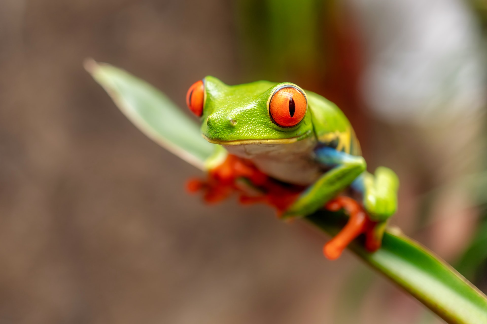
<img src="/images/carousel/1.jpg" class="d-block w-100" alt="frog" />
</div>
<div class="carousel-item">
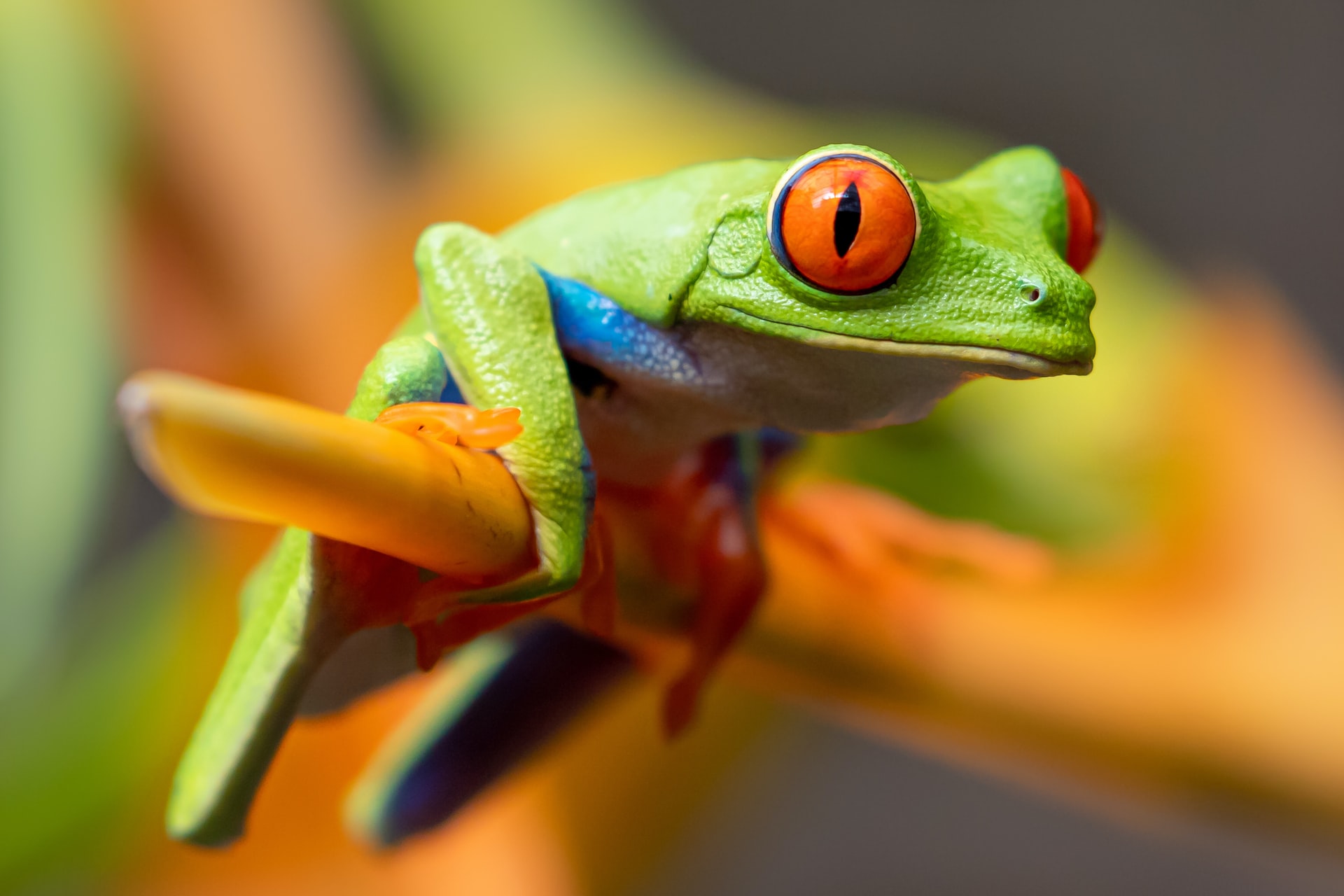
<img src="/images/carousel/2.jpg" class="d-block w-100" alt="frog" />
</div>
<div class="carousel-item">
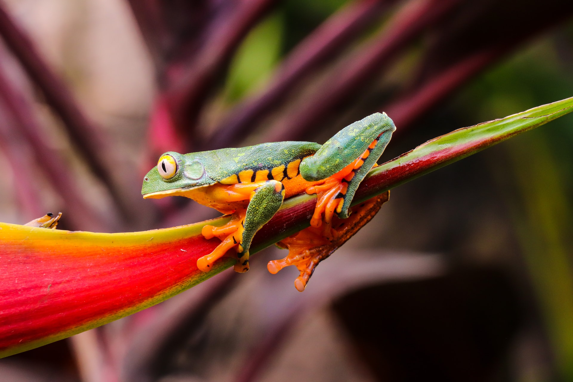
<img src="/images/carousel/3.jpg" class="d-block w-100" alt="frog" />
</div>
</div>
<button class="carousel-control-prev" type="button" data-bs-target="#carouselBasicExample" data-bs-slide="prev">
<span class="carousel-control-prev-icon" aria-hidden="true"></span>
<span class="visually-hidden">Previous</span>
</button>
<button class="carousel-control-next" type="button" data-bs-target="#carouselBasicExample" data-bs-slide="next">
<span class="carousel-control-next-icon" aria-hidden="true"></span>
<span class="visually-hidden">Next</span>
</button>
</div>How it works
The carousel is a slideshow for cycling through a series of content, built with CSS 3D transforms and a bit of JavaScript. It works with a series of images, text, or custom markup. It also includes support for previous/next controls and indicators.
In browsers where the Page Visibility API is supported, the carousel will avoid sliding when the webpage is not visible to the user (such as when the browser tab is inactive, the browser window is minimized, etc.).
Please be aware that nested carousels are not supported, and carousels are generally not compliant with accessibility standards.
Variations
Carousels don’t automatically normalize slide dimensions. As such, you may need to use additional utilities or custom styles to appropriately size content. While carousels support previous/next controls and indicators, they’re not explicitly required. Add and customize as you see fit.
The .active class needs to be added to one of the slides otherwise the carousel will not be visible. Also be sure to set a unique id on the .carousel for optional controls, especially if you’re using multiple carousels on a single page. Control and indicator elements must have a data-bs-target attribute (or href for links) that matches the id of the .carousel element.
Slides only
Here’s a carousel with slides only. Note the presence of the .d-block and .w-100 on carousel images to prevent browser default image alignment.


<div id="carouselExampleSlidesOnly" class="carousel slide" data-bs-ride="carousel">
  <div class="carousel-inner">
    <div class="carousel-item active">
      <img class="d-block w-100" src="/images/carousel/4.jpg" alt="Tokyo" />
    </div>
    <div class="carousel-item">
      <img class="d-block w-100" src="/images/carousel/5.jpg" alt="Shanghai" />
    </div>
    <div class="carousel-item">
      <img class="d-block w-100" src="/images/carousel/6.jpg" alt="Newyork" />
    </div>
  </div>
</div>
With controls
Adding in the previous and next controls. We recommend using <button> elements, but you can also use <a> elements with role="button".
<div id="carouselExampleControls" class="carousel slide" data-bs-ride="carousel">
  <div class="carousel-inner">
    <div class="carousel-item active">
      <img class="d-block w-100" src="/images/carousel/1.jpg" alt="frog" />
    </div>
    <div class="carousel-item">
      <img class="d-block w-100" src="/images/carousel/2.jpg" alt="frog" />
    </div>
    <div class="carousel-item">
      <img class="d-block w-100" src="/images/carousel/3.jpg" alt="frog" />
    </div>
  </div>
  <button class="carousel-control-prev" type="button" data-bs-target="#carouselExampleControls" data-bs-slide="prev">
    <span class="carousel-control-prev-icon" aria-hidden="true"></span>
    <span class="visually-hidden">Previous</span>
  </button>
  <button class="carousel-control-next" type="button" data-bs-target="#carouselExampleControls" data-bs-slide="next">
    <span class="carousel-control-next-icon" aria-hidden="true"></span>
    <span class="visually-hidden">Next</span>
  </button>
</div>
With indicators
You can also add the indicators to the carousel, alongside the controls, too.
<div id="carouselExampleIndicators" class="carousel slide" data-bs-ride="true">
  <div class="carousel-indicators">
    <button type="button" data-bs-target="#carouselExampleIndicators" data-bs-slide-to="0" class="active" aria-current="true" aria-label="Slide 1"></button>
    <button type="button" data-bs-target="#carouselExampleIndicators" data-bs-slide-to="1" aria-label="Slide 2"></button>
    <button type="button" data-bs-target="#carouselExampleIndicators" data-bs-slide-to="2" aria-label="Slide 3"></button>
  </div>
  <div class="carousel-inner">
    <div class="carousel-item active">
      <img class="d-block w-100" src="/images/carousel/1.jpg" alt="frog" />
    </div>
    <div class="carousel-item">
      <img class="d-block w-100" src="/images/carousel/2.jpg" alt="frog" />
    </div>
    <div class="carousel-item">
      <img class="d-block w-100" src="/images/carousel/3.jpg" alt="frog" />
    </div>
  </div>
  <button class="carousel-control-prev" type="button" data-bs-target="#carouselExampleIndicators" data-bs-slide="prev">
    <span class="carousel-control-prev-icon" aria-hidden="true"></span>
    <span class="visually-hidden">Previous</span>
  </button>
  <button class="carousel-control-next" type="button" data-bs-target="#carouselExampleIndicators" data-bs-slide="next">
    <span class="carousel-control-next-icon" aria-hidden="true"></span>
    <span class="visually-hidden">Next</span>
  </button>
</div>
With captions
Add captions to your slides easily with the .carousel-caption element within any .carousel-item. They can be easily hidden on smaller viewports, as shown below, with optional display utilities. We hide them initially with .d-none and bring them back on medium-sized devices with .d-md-block.
Tokyo (Japan)
Some representative placeholder content for the first slide.
Shanghai (China)
Some representative placeholder content for the second slide.
Newyork (United states)
Some representative placeholder content for the third slide.
<div id="carouselExampleCaptions" class="carousel slide" data-bs-ride="false">
  <div class="carousel-indicators">
    <button type="button" data-bs-target="#carouselExampleCaptions" data-bs-slide-to="0" class="active" aria-current="true" aria-label="Slide 1"></button>
    <button type="button" data-bs-target="#carouselExampleCaptions" data-bs-slide-to="1" aria-label="Slide 2"></button>
    <button type="button" data-bs-target="#carouselExampleCaptions" data-bs-slide-to="2" aria-label="Slide 3"></button>
  </div>
  <div class="carousel-inner">
    <div class="carousel-item active">
      <img class="d-block w-100" src="/images/carousel/4.jpg" alt="Tokyo" />
      <div class="carousel-caption d-none d-md-block">
        <h5>Tokyo (Japan)</h5>
        <p>Some representative placeholder content for the first slide.</p>
      </div>
    </div>
    <div class="carousel-item">
      <img class="d-block w-100" src="/images/carousel/5.jpg" alt="Shanghai" />
      <div class="carousel-caption d-none d-md-block">
        <h5>Shanghai (China)</h5>
        <p>Some representative placeholder content for the second slide.</p>
      </div>
    </div>
    <div class="carousel-item">
      <img class="d-block w-100" src="/images/carousel/6.jpg" alt="Newyork" />
      <div class="carousel-caption d-none d-md-block">
        <h5>Newyork (United states)</h5>
        <p>Some representative placeholder content for the third slide.</p>
      </div>
    </div>
  </div>
  <button class="carousel-control-prev" type="button" data-bs-target="#carouselExampleCaptions" data-bs-slide="prev">
    <span class="carousel-control-prev-icon" aria-hidden="true"></span>
    <span class="visually-hidden">Previous</span>
  </button>
  <button class="carousel-control-next" type="button" data-bs-target="#carouselExampleCaptions" data-bs-slide="next">
    <span class="carousel-control-next-icon" aria-hidden="true"></span>
    <span class="visually-hidden">Next</span>
  </button>
</div>
Crossfade
Add .carousel-fade to your carousel to animate slides with a fade transition instead of a slide. Depending on your carousel content (e.g., text only slides), you may want to add .bg-body or some custom CSS to the .carousel-items for proper crossfading.
<div id="carouselExampleFade" class="carousel slide carousel-fade" data-bs-ride="carousel">
  <div class="carousel-inner">
    <div class="carousel-item active">
      <img class="d-block w-100" src="/images/carousel/1.jpg" alt="frog" />
    </div>
    <div class="carousel-item">
      <img class="d-block w-100" src="/images/carousel/2.jpg" alt="frog" />
    </div>
    <div class="carousel-item">
      <img class="d-block w-100" src="/images/carousel/3.jpg" alt="frog" />
    </div>
  </div>
  <button class="carousel-control-prev" type="button" data-bs-target="#carouselExampleFade" data-bs-slide="prev">
    <span class="carousel-control-prev-icon" aria-hidden="true"></span>
    <span class="visually-hidden">Previous</span>
  </button>
  <button class="carousel-control-next" type="button" data-bs-target="#carouselExampleFade" data-bs-slide="next">
    <span class="carousel-control-next-icon" aria-hidden="true"></span>
    <span class="visually-hidden">Next</span>
  </button>
</div>
Individual .carousel-item interval
Add data-bs-interval="" to a .carousel-item to change the amount of time to delay between automatically cycling to the next item.
<div id="carouselExampleInterval" class="carousel slide" data-bs-ride="carousel">
  <div class="carousel-inner">
    <div class="carousel-item active" data-bs-interval="10000">
      <img class="d-block w-100" src="/images/carousel/1.jpg" alt="frog" />
    </div>
    <div class="carousel-item" data-bs-interval="2000">
      <img class="d-block w-100" src="/images/carousel/2.jpg" alt="frog" />
    </div>
    <div class="carousel-item">
      <img class="d-block w-100" src="/images/carousel/3.jpg" alt="frog" />
    </div>
  </div>
  <button class="carousel-control-prev" type="button" data-bs-target="#carouselExampleInterval" data-bs-slide="prev">
    <span class="carousel-control-prev-icon" aria-hidden="true"></span>
    <span class="visually-hidden">Previous</span>
  </button>
  <button class="carousel-control-next" type="button" data-bs-target="#carouselExampleInterval" data-bs-slide="next">
    <span class="carousel-control-next-icon" aria-hidden="true"></span>
    <span class="visually-hidden">Next</span>
  </button>
</div>
Disable touch swiping
Carousels support swiping left/right on touchscreen devices to move between slides. This can be disabled using the data-bs-touch attribute. The example below also does not include the data-bs-ride attribute so it doesn’t autoplay.
<div id="carouselExampleControlsNoTouching" class="carousel slide" data-bs-touch="false">
  <div class="carousel-inner">
    <div class="carousel-item active">
      <img class="d-block w-100" src="/images/carousel/4.jpg" alt="tokyo" />
    </div>
    <div class="carousel-item">
      <img class="d-block w-100" src="/images/carousel/5.jpg" alt="shanghai" />
    </div>
    <div class="carousel-item">
      <img class="d-block w-100" src="/images/carousel/6.jpg" alt="newyork" />
    </div>
  </div>
  <button class="carousel-control-prev" type="button" data-bs-target="#carouselExampleControlsNoTouching" data-bs-slide="prev">
    <span class="carousel-control-prev-icon" aria-hidden="true"></span>
    <span class="visually-hidden">Previous</span>
  </button>
  <button class="carousel-control-next" type="button" data-bs-target="#carouselExampleControlsNoTouching" data-bs-slide="next">
    <span class="carousel-control-next-icon" aria-hidden="true"></span>
    <span class="visually-hidden">Next</span>
  </button>
</div>
Custom transition
The transition duration of .carousel-item can be changed with the $carousel-transition-duration Sass variable before compiling or custom styles if you’re using the compiled CSS. If multiple transitions are applied, make sure the transform transition is defined first (eg. transition: transform 2s ease, opacity .5s ease-out).